
13 Apr What Makes A Bad Website? 5 Things To Avoid and How To Do It Better
As users of the web, we all face the same frustration. We frantically look for the ‘X’ on the pop-up requiring us to join a mailing list or to accept agreement terms just to get back to what we were looking at.
Sites like these are less likely to gain clicks or views if users decide to close the tab to avoid the hassle. Thus, it goes without saying: a poorly designed website will directly affect user experience.
Perhaps you are a business owner setting up a website for your company and having little success with it. That’s because it is not as simple as putting up a site and promoting it. A site that is difficult to navigate will 100% leave visitors with a sour taste.
A properly developed website will be able to change
your brand and boost the image that it carries.
Here are some mistakes to watch out for when creating your own website design.
1. No obvious point or message.
You only have mere seconds to impress visitors before they click the Back button.
Sites should clearly state the message of their webpage or in other cases, the title of their article. One of the biggest mistakes that companies make is by not establishing the name and nature of their business.
You need to capture interest by providing users with the
substance that are scroll-worthy.
An example would be the site CyberDsignClan with a “Skip Intro” word that looks out of the place. The message of the site is missing. Visitors would be confused in what they are supposed to do to enter the website.
After clicking on the page, the real homepage appears but it is all just a mess. There is no structure and it complicates things further with its cluttered interface. The contents of the page are all jumbled with disorganised font types with different sizes.
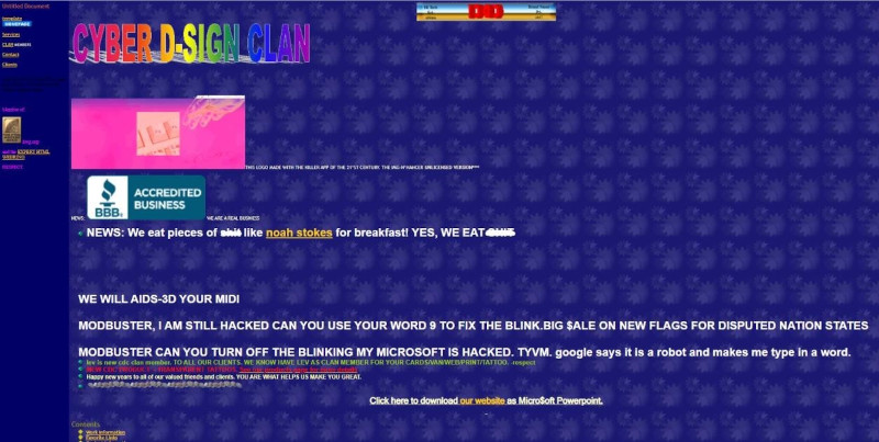
The CyberDsignClan site looks tacky and poorly stylised for visual emphasis.
Source: CyberDsignClan
Users need to skim through all that convoluted text just to be able to grasp an idea of the company’s products and services. If a user feels inconvenienced, the exit button is just a click away and a potential customer is lost.
To fix this, we need to portray the hero section of the page well. That specific section includes everything that appears on the page before users have to scroll any further down. It is important to insert the business name and an icon or message to indicate the product that they are selling. Proper columns should be set up at the top of the page for a quick overview of the site.
2.Jumbled elements on homepage
A homepage should be simple and straight forward. It would allow users to navigate to the page they want and obtaining the needed information. Without a clear layout, navigations become hard and visitors will leave and find other websites.
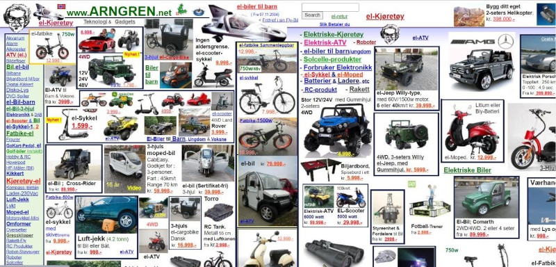
Arngren.net is an example that depicts this problem. The first thing we see when we click into the website is all sorts of listings muddled up with no organization at all. Users feel clouded not knowing where to start or which listing to look at. Items posted are not divided into any categories with random pictures popping up in any available space.
There are marketplace sites that are a never-ending scroll of products that demonstrate it is possible to display a lot of content without cluttering the page. Try checking out Lazada Malaysia or Shopee Malaysia.
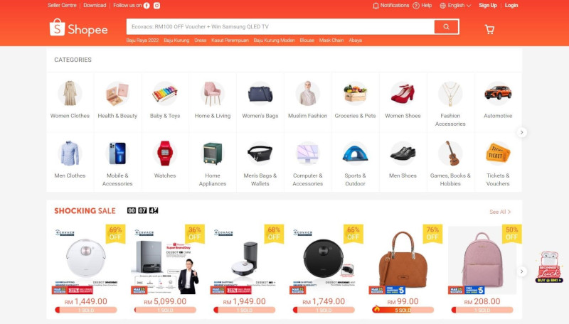
The Shopee site makes you feel as if you can breathe!
Source:Shopee Malaysia.
With a good website design, they can present thousands of products to users making them want to browse more. This is due to the listings being organized in grids instead of fitting each other like a big jigsaw puzzle.
3.No mobile version for website
It is proven that majority of internet traffic in Malaysia are from mobile devices such as tablets, smartphones and consoles. However, there are still many websites that are built for desktop version and not optimized for mobile devices. Visitors will not be able to gain the full experience that the website has to offer.
With responsive design, sites will make elements in the webpage readjusted according to the screen width of the user’s device. On some occasions where the device has a small screen, certain pictures, videos, fonts and backgrounds may be hidden or distorted. For worst cases, websites may be completely unreadable or will not load on lower-end devices.
For instance, if you are using a mobile browser, check out San Diego Coupons. The interface does not load for mobile versions. Another example of a non-responsive web design is one made by Deque University. Try adjusting the width of the browser when you visit the site. The page layout is fixed even if the browser width is smaller, making it impossible to read unless you scroll from left to right repeatedly.
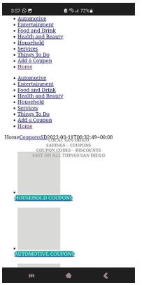
Lack of mobile optimisation is unacceptable in this day and age.
Source: San Diego Coupons.
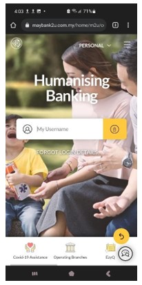
There are many amazing responsive designs now in the web. Visit any major company websites like Maybank and see how made sure the site fits perfectly on all your mobile devices.
4.Site that loads too slow
In these modern days, no one has extra time on their hands. The Internet springs open with a snap of a finger.
What if you click on something and it takes eternity for it to load? Almost surely you would click on the “Back” button or close the window. Technology these days have made everything instantaneous, so nothing deserves to waste your time, especially poor designs that are avoidable. Even if your website has a stunning design with excellent content, no one is going to stare patiently for it to load.
Studies have shown that 40% of users will leave once it takes 3 seconds or more of waiting. Even just 1 second can affect a 7% drop in website conversions. A website conversion happens when a user completes a desired action on your website, like making a purchase or filling out a contact form. Every business website is built to generate conversions.

Pages that have large files and auto play videos drag the loading time. You should attach only necessary elements in a website, especially for the homepage. Once you shoo away the visitor with the lengthy wait, they will not be able to explore other details that you have to offer. Never put too many images and use JavaScript excessively as it might cause the page to load painfully slower.
5.Poor design and lack of contact information
When people visit your site, they are here to gather information about your company or products. The website design should be convenient and easy-to-find especially for the menu and category section. If the design makes the visitor work too hard to find what they need, they might leave altogether. To avoid this, include a search box for users to quickly find redirects to the keywords they are searching for.
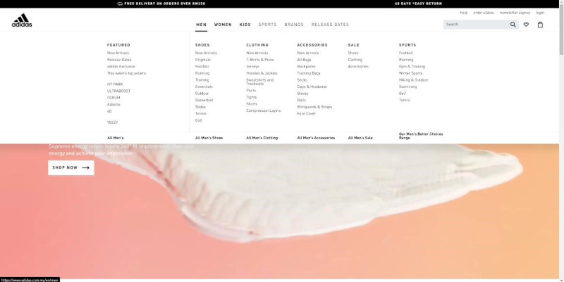
Avoid using floating or moving graphics as clickable links. They load at an extremely slow speed and may possibly slow down the navigation process. Focus on creating a menu that is easy to open and browse such as a typical drop-down list as portrayed by Adidas. It has all the categories right at the menu, making the website simple and easy to access.
Not forgetting that a good design would include visible contact information for further enquiries. The Internet is an anonymous place and most people would not be familiar with your company. Visitors would need reassurance that there are real people working in your company.
Clear contact information can add legitimacy to a
company’s website and help abundance in building
trust with customers.
The least we could do is to provide contact details for them to feel confident when placing their orders in case any problems arise. Ensure that the e-mail address and contact number put up on the website is always available and online to avoid lost calls or bounced back e-mails.

All of the above mentioned is easy to avoid now that you have an idea of what to look out for. Always keep in mind to make your site welcoming and pleasing to the eye. Website development does require technical expertise and necessary planning in order to create a better user experience.
Nevertheless, it does not mean you have to invest in expensive web designers or use a very complex design. Many web design templates are free and easy to use, and will provide good-enough websites for your company.
Ultimately, the aim of a site should be to benefit visitors seeking information about your
business and products. Keeping it simple and straightforward is the best way.